
Please take a look, and feel free to give us your feedback. We strive to make it easier for our clients and users to learn about marketing, and understand how our team can help them promote and grow their business through online marketing and design strategies.
Key new features of our website:
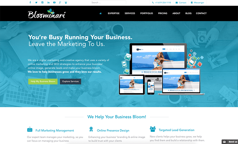
Brand new homepage: Includes new sections that explain the key ways in which we help businesses, the main reasons companies choose to work with us, new featured projects, new testimonials, client logos, and our newest monthly marketing packages.
Consistent and professional branding: We love colors, and a little too much, so our original site had pretty much every color of the rainbow. Yet, we know that branding requires to use a set consistent set of colors and graphics, so we’ve now applied those important concepts into our new website. We created lots of new images, backgrounds and icons using our 5 main Bloominari branding colors.
New expertise page: On this page we show prospective small and medium business how our team of marketing, design and technology experts helps them grow their business online.
New process page: We explain our 5 key marketing phases, as well as our detailed 12 step plan for developing a complete online marketing campaign.
New partners and associations page: Learn about the associations and partnerships with various local San Diego and nationwide organizations that our company is a part of.
Introductory graphics: We’ve designed new introductory graphics for our five core services pages and sub-pages to make it easier for our users to know what section of the website they’re on, as well as for branding purposes.

Introduced a cleaner, modern design style: We removed all colorful background graphics, 3D styles, parallax modules, and replaced them with white backgrounds, lots of additional white space, "flat design" graphics and easier to read content.
Easily scannable content: We replaced long and “boring” texts with shorter, easy-to-read mini sections throughout our pages. The goal is to make it easy for people to simply read the titles and subtitles of each section in order to quickly capture what we want to communicate. Then, if they're still interested they have the choice to read the short gray-colored paragraph and/or also click the “Learn more” or call-to-action buttons to explore even more.

New menu organization: To make it easier to browse our site, we condensed many of our drop-down menu choices, and added a "Useful links" menu on our footer for easy access to our most common pages.
Online forms connected to our CRM: We completely rebuilt our online forms, and chose to use JotForms to do so. We then integrated our forms directly with our AgileCRM software using Zapier. Now, every time anyone fills out a form we’ll get a notification e-mail and also have the information saved directly into our CRM. This makes it much easier to follow up with people as part of our sales and marketing efforts.
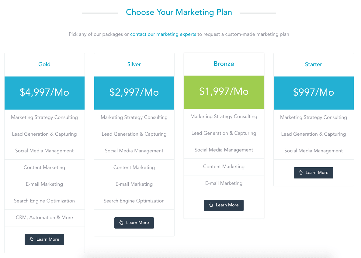
Introduced our new complete marketing packages: We re-created our monthly marketing management services packages from the ground up. We began by spending weeks developing what we called our “Marketing Blueprint” and we then used it to build our packages. The goal and focus of these new packages is to help our clients invest their marketing budgets more wisely, by focusing on services that brings them clients and sales faster.

New Join The Team Page: Now we have a place to showcase our new job opportunities so that prospective team members can easily find out about opportunities to become part of the Bloominari team.
Added new social media icons: We included links to our SlideShare and YouTube profiles.
New ways to get in touch: We added a way to get in touch with us via Telegram, and Facebook Messenger.


Have any comments or ideas for improving our site even more?
Please let us know, we really value what you think and are always open to making our website better :-)
Thanks a lot!
Jaime Nacach, Bloominari Founder
